Smart software application design has nothing to do with skinning your software with flashy graphics or weighing down the interface with this week’s “must have” functionality. Rather, software applications are most successful when programmers streamline features in a way that balance the ergonomics of user interaction against the impact of user’s environment on the use of the application. Therefore, as developers, we want to take an ergonomic approach to design in order to ensure the success of applications, and this means considering not only what it takes to ensure the user’s interaction with the software is as natural as possible in relation to the device being used, but also how a user’s environment will affect the usage of the software.
If you haven’t worked with us to develop a software solution for your business, you might be asking yourself, “But, does Kays Harbor Technologies really take this ergonomic-focused solutions concept seriously when considering my company’s software needs?” The fact is, we take ergonomics seriously enough that we even apply the strategy to our in-house projects. Take for example Kays Harbor’s in-house cafeteria application, the Kays Cafe.
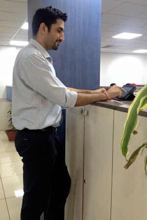
 One of the employees using our in-house android app – Kays Cafe.
 One of the benefits of working at Kays Harbor Technologies is that we provide our employees with a fixed number of credits at the start of each month, which they can then use to “purchase” food, beverages, and packaged goods at our in-office cafeteria. We enjoy an environment of transparency and trust, and each employee was entrusted to record their consumption on paper. At the end of the month, the records would be aggregated and credits would be adjusted accordingly. While accurate, this was a cumbersome process for our administrative staff. We decided to automate this process, which would simplify the accounting process and management of inventory. Our developers set out to design a mobile application that could manage inventory and track employee credits automatically. The project came to life as an Android-based application called the Kays Cafe, which runs on a company-owned Samsung Tab, placed at an arm’s length within the office cafeteria.
The concept behind the application was solid. We had a fair understanding of ergonomic design going into the project and some base assumptions of how the employees would interact with the software in conjunction with the tablet. Once we released the app into a live setting and monitored the outcome, we immediately realized that there were some opportunities to tweak the application in a way to improve upon the design. We watched how the employees used the tablet, how they interacted with the user interface of the application, and discussed with them about how they felt the application functioned and how it should function. We were able to identify two major opportunities for improvement, and made changes to the application in order to improve the comfort of the target users.
Initially designed in portrait mode to allow more items to show up on the screen, we realized that Samsung Tab we were using and its associated outer case coverings weren’t designed to stand vertically on surfaces. This caused the tablet to be constantly picked up and handled, resulting in charging issues and introducing a level of inefficiency to the interface process. Converting the interface to a landscape mode and redesigning the UI allowed users to interact with the tablet without picking it up. The unit remained in charging mode and the process of interacting with the application was significantly streamlined.
The initial application used small buttons, small text, and scrolling screens in order to display information. There was also concern with the mounting of the tablet and how best to display it so users could immediately access it, again focusing not just on the application itself but also the environment in which the user was interfacing with the software. After studying employees of different statures interacting with the device, we decided on an ideal placement of the tablet, with plenty of space for users to place their arms or hands, and a method by which it could be easily tilted and adjusted for visibility. We also increased the size of the application’s interface buttons, adjusted font size and type for a wider readability factor, and ensured that text and buttons remained fixed rather than allowing a scroll for key UI elements.
We’ve already seen an improvement in employee interaction with the application and have received much positive feedback. That doesn’t stop us from continuing to monitor opinions and usage of the application; while we’ve established a very strong foundation, we as developers understand and accept that we can always make improvements. We embrace the challenge of constantly improving upon our own design to improve the user experience.
And that’s our goal whenever we take on a new client at Kays Harbor Technologies. We want to ensure that we not only meet your software needs on a technical level, but that we do so in an ergonomically conscious and savvy way. Because ensuring your users are happy and comfortable goes a long way towards retaining their business over time.

