
12 design principles of a modern eCommerce store
There are several factors that influence the success of this business. Design is a major one.
Therefore, designing a modern eCommerce store requires multiple levels of expertise. An artistic approach with a mix of creativity and analytical talent has become a must for the designers of today.
And why is it so?
A complementing user interface and user experience is a key indicator of how good and valuable your online store is to the consumer. An expert knows how to create harmony between the art and science of an eCommerce store’s aesthetics and functionalities that will keep the users coming back for more.
Below are some of the best practices for eCommerce store design that we personally recommend to help you create a user-friendly and high-quality experience for your customer:
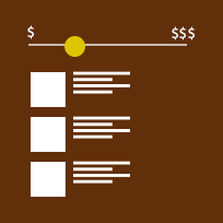
1. Publish easy to scan and skimmable content
 As per a Microsoft study, human beings in 2013 had an attention span of 8 seconds. It means that any information that takes more than 8 seconds to consume has the probability of getting lost in the vortex of distraction!
The solution is to break up content into a format that is easily scannable or we can say one which is easy to skim (since most of the readers usually skim through the content and a majority just reads the headline). The design of the page should guide users through the information quickly and efficiently, so the user’s attention doesn’t wander off.
2. Create clear and an easy-to-read copy

Users like to read content that is clear to the eyes and easier to infer. Sometimes, a fancy font might look gorgeous but is hard to read or navigate. That is why, fonts can make or break your design.
Use clear and readable fonts with proper line spacing. A beautiful page might attract users but the content is what keeps the users engaged. Restrict font usage to one or two at the most.
Retailers generally use font families that are legible and cross platform compatible. Unreadable typography can stop users from enjoying the content. Make sure your copy is more than 13px – a 16px font is advisable for mobile devices.
3. Offer simple and interconnected ways to navigate

Providing large amounts of information or data without breaking it into headings and paragraphs on a single page can clutter up the design. In addition to this, it affects the readability and UX on mobile devices.
Card navigation can be an antidote to the clutter. It simplifies the experience. If there is concern that customers will miss out on information, use the simple breadcrumb method to keep them hooked.
Use small bits of information to lead customers from one page to another. It makes the user experience more enjoyable.
4. Avoid mandatory sign-up and keep it minimal

Sign-up plays an important role in customer acquisition. Any glitch or complexity in the sign-up process can dissuade users from following through with memberships, subscriptions, and purchases.
Design a sign-up process with easy navigation steps and a minimum number of hops. It creates a contract of trust between the business owner and the customer.
Micro-interactions on your signup page help to keep the customer engaged. Also, concise instructions to guide the users through the whole process make users feel comfortable with all the steps.
In most of the cases, sign-up shouldn’t be mandatory. Allowing guest logins or registration through social accounts is an easy way to avoid losing out a major chunk of customers.
5. Use meaningful and differentiable call-to-actions (CTAs)

CTAs convert an interested party into a customer. It is crucial that a CTA is visually easy to detect. Also, the action associated with the CTA should be easily distinguishable.
Avoid using similar CTA buttons or links for product sizes, buy actions, and out-of-stock options since they generally create confusions. They should be unique and differentiate the actions clearly for the customers.
Use bright colors to grab attention of your prospective customers into buying. However, they should be meaningful. False CTAs or those leading to irrelevant content make you lose your prospects.
6. Help customers drill down products using filtering and sorting
Customers of today expect eCommerce sites to accommodate their tastes. Filters and sorting options based on brand, price, popularity, and relevance make a store more accessible. It can improve your customer engagement.
Designers can apply their creativity to the color palettes of filters and sorting options to make the process more visually appealing. It can help a business create the unique look and feel to stand out in the marketplace.
7. Make checkouts easy-peasy
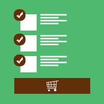
A checkout is the final point of the customer’s decision-making process. At this stage, distractions can be detrimental. Avoid offers of unrelated products and services; these create distractions on checkout pages.
Create fewer hops or landing pages to reach the destination. The whole process should be a breeze!
But don’t forget to be transparent here. Make sure that shipping costs and payment methods are properly displayed, so the users can trust your eCommerce store.
8. Show your customers how well people rate you

Reviews and testimonials are effective tools for marketing. According to marketing guru Neil Patel, reviews can increase sales by 18 percent.
Not only this, a product review section promotes customer participation. People trust an eCommerce store with an engaged clientele. It gives them a sense of security. They generally read through the reviews other customers have dropped on your product to make easier decisions.
Make use of reviews and ratings for your products to give users better authority over the product and services. It is an important aspect of the overall design.
9. Save your customers time with personalizing

Give your customer what they want. Make your product pages extra personal, and show them the value proposition.
Favorites, wish-lists, recently viewed, special offers, and recommended products can make your product pages more user-friendly and accessible. Include the important key elements in the product pages that essentially increase your conversion rates.
These features make an e-store on the whole feel familiar to the customer. They save the customers time and money and they don’t have to short-list again the products they liked in the past and for some reason did not buy them.
10. Make products discoverable with internal search

Internal search options improve discoverability of your products without the user having to find the actual product he/she is looking to buy. It increases customer satisfaction.
Ensure that your internal search is at the top header of the store for users to discover easily. It promotes engagement. The longer the customer stays on a store site, the more likely they are to make a purchase.
There are several ecommerce platforms available in the industry, one of the most recommended being the Magento that are tuned to provide an efficient internal search module which is easy to plug into the code.
11. Optimize your design for the mobile generation

The mobile marketplace is a big part of the eCommerce business today. Experts have predicted over 200% growth of mCommerce. Thus, an optimized mobile experience is critical to your business.
Make the store mobile-friendly with minimum load times, readable texts, and properly scaled images and CTAs. Avoid auto-rotating carousels on your homepage because it is annoying on a small screen.
Zoomable product images make it easier to navigate on a mobile device. Keep in mind, if you’re not targeting mobile audience, you might be losing out on conversions.
12. Present an impressive homepage

Your homepage is the first impression. Customers make initial judgment based on this impression.
Using catchy headlines, featured products, and latest promotions, a homepage can funnel customers to the relevant parts of the store. Understanding the dynamics of how customers interact with a site can help create a more effective first impression.
Also, implementing key features of an ideal homepage can make the whole store more valuable to the customer.
Conclusion
Creating a simple and clear design requires a lot of complex thought and hard work.
However, trial and error is the key to a good design. Implementing bold features and testing their effects will help you get the idea of how to design your store for the modern consumer. The above principles are tested ideas that can help make it easier for you to think through the process.
Did we miss out on anything more? Feel free to share it by adding your comments below or tweet it to us!